Analysis & Interpretation
AIKON provides visualization interfaces to help researchers examine transmission networks and circulation patterns across corpora.
Set-Level Visualizations
Document set views aggregate similarity data across multiple witnesses. These interactive visualizations help identify document relationships.
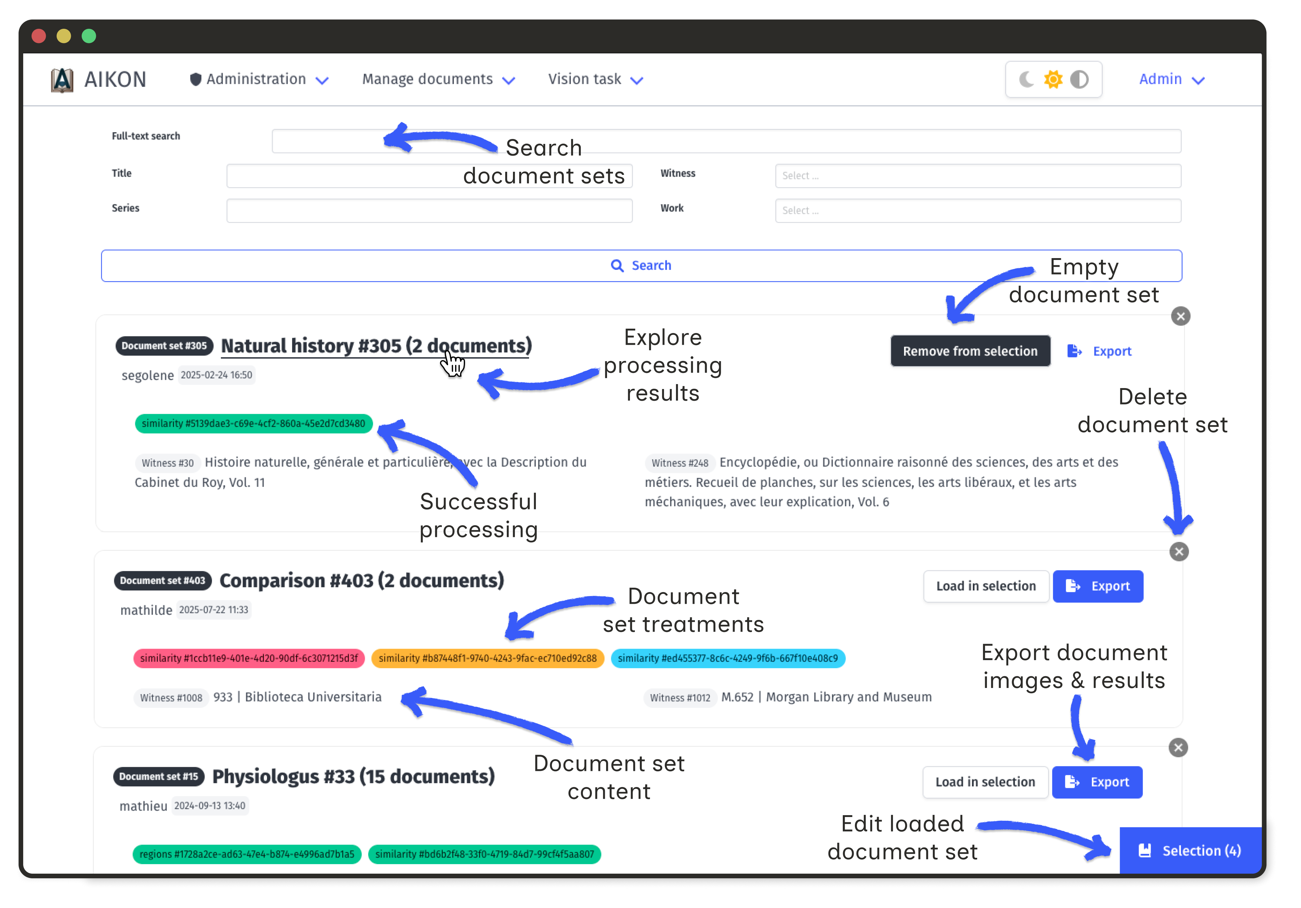
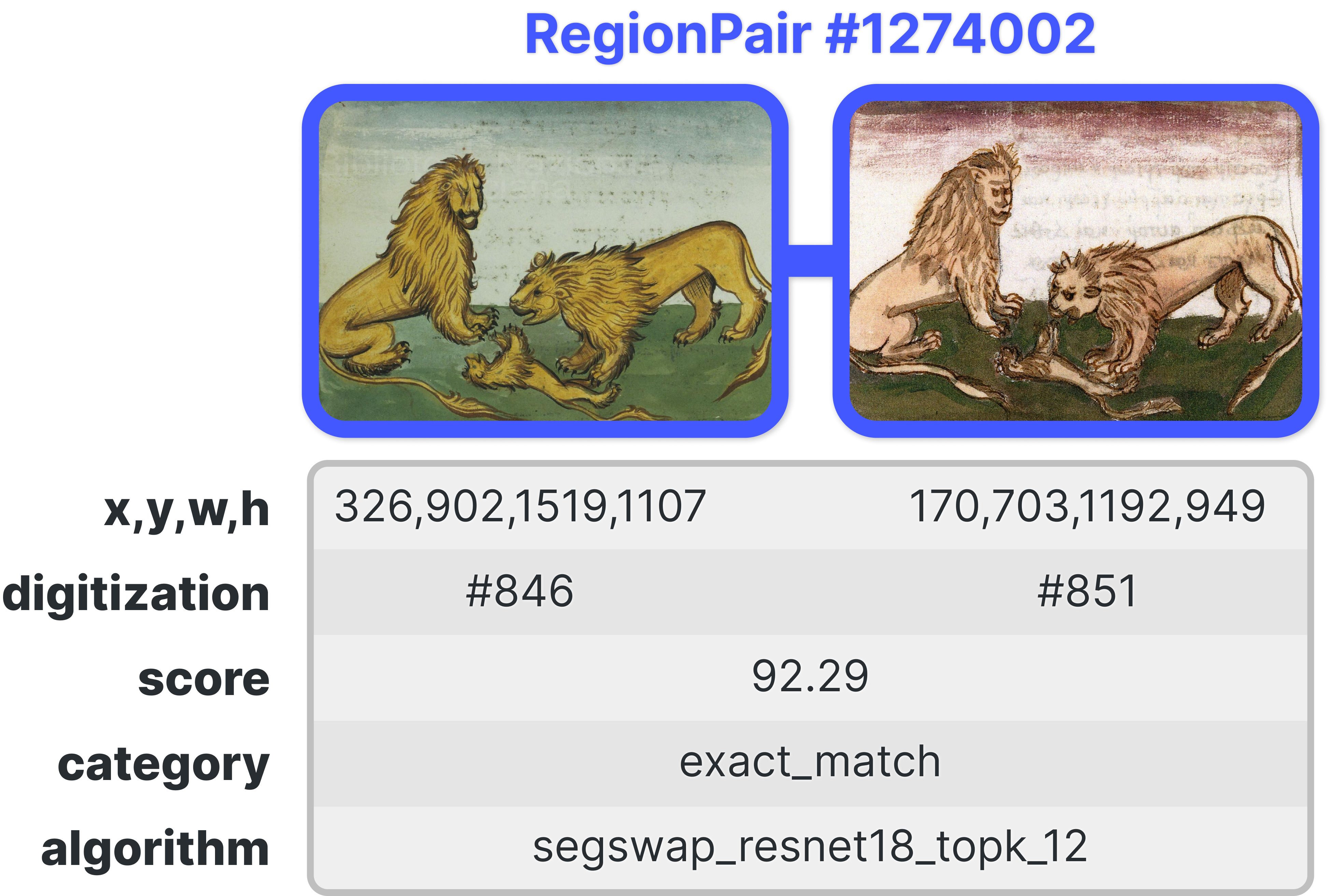
All visualisations rely on the same underlying data: each document holds a number of extracted image regions, and each region is linked to a number of similar regions in other documents.
This link is stored as a pair of images, associated with an automatic similarity score, a user-defined category and information on the algorithm used to compute the score.
Filtering Options
All visualizations support filtering using sidebar controls:
- Document Filter by document to focus on specific witnesses
- Category Filter by similarity category (exact, partial, semantic, etc.)
- Score Adjust score thresholds to show only high-confidence matches
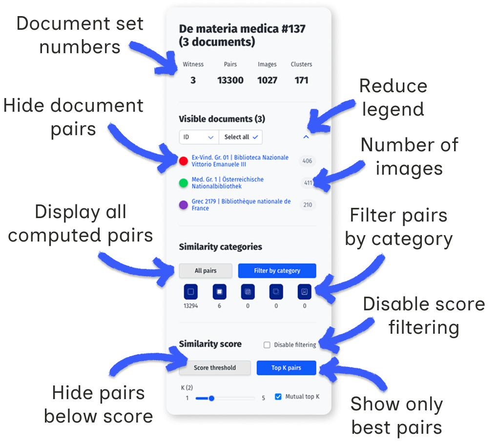
Category filtering
Categories are user-defined labels that qualify the type of similarity between two regions. By default, only pairs marked as exact matches are displayed.
Changing the category selection triggers a new request to the server. The initial load when selecting "All pairs" may take a few seconds depending on corpus size.
Document filtering
A document set groups series, works, and witnesses. Each witness may have one or more digitizations, from which image regions are extracted. The visualization displays pairs of similar regions across these digitizations.
The "Visible documents" legend lists all digitizations in the current set. Each digitization is represented by a colored dot. A single witness may appear multiple times if it has several digitizations. The grey number indicates how many regions were extracted from each digitization.
Click on a dot to show or hide pairs containing regions from that digitization. When changing category selection, new digitizations may appear unselected in the legend; use "Select all" to include them.
The legend can be collapsed to show only dots using the bracket icon. Sorting options allow reordering by title, witness, or ID.
Score filtering
Each pair has a weighted score combining the computed similarity score with the category weight:
| Category |

|

|

|

|

|

|
|---|---|---|---|---|---|---|
| Weight | 0 | 1.0 | 0.5 | 0.125 | −1.0 | 0.125 |
Two filtering modes are available:
- Score threshold: display only pairs above a minimum weighted score.
- Top K: for each region, keep only the K highest-scoring pairs. With "Mutual top K" enabled, both regions must rank each other in their top K.
Clusters
Document set clusters group images that are linked by at least on pair of similarities whose score exceeds the selected threshold.
Matrix Visualization
The similarity matrix shows pairwise document comparisons. Color intensity indicates the number of similar regions between documents.
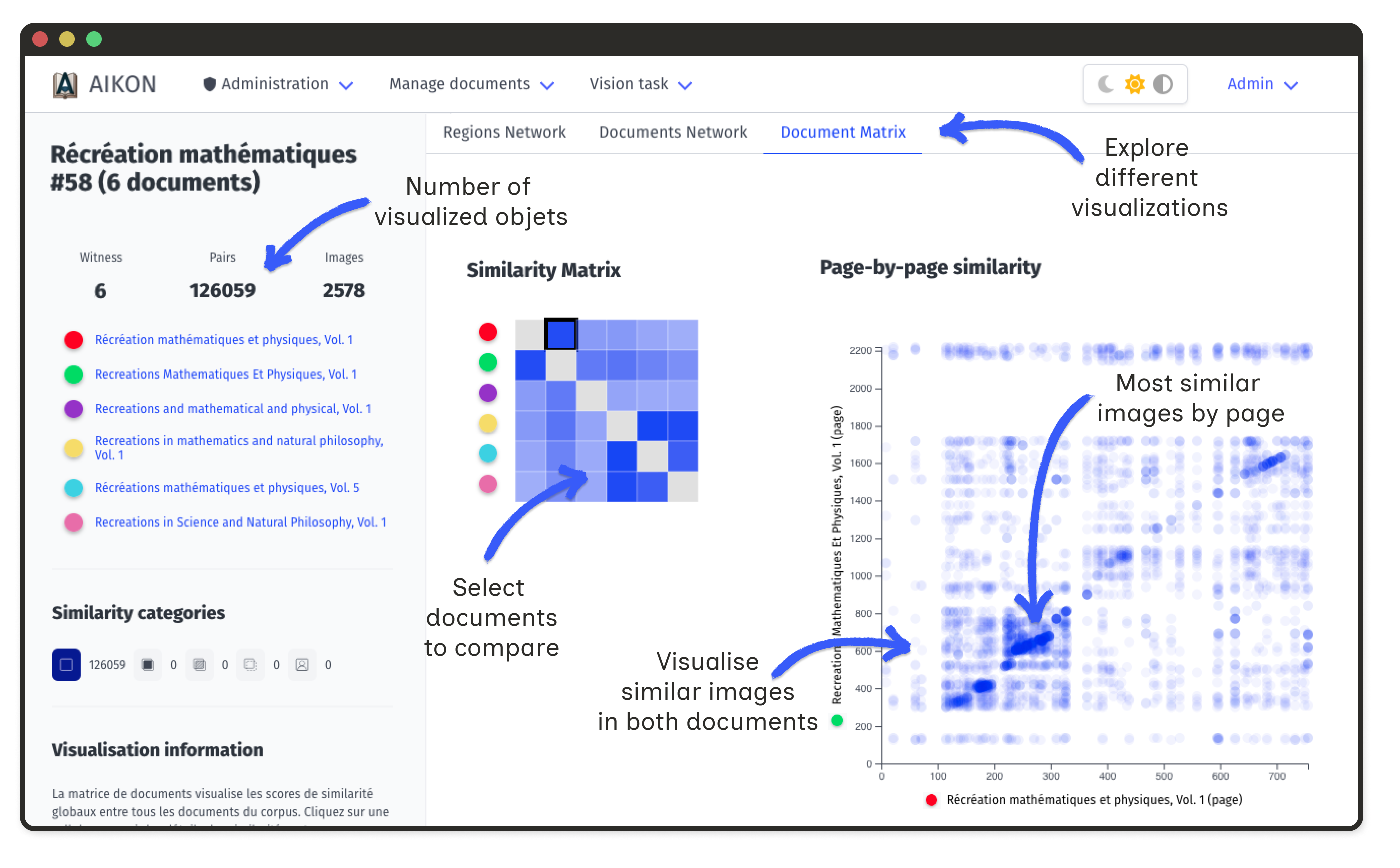
Click on a cell to open a detailed matrix for that document pair. Axes show ordered illustrations; intensities reflect similarity ranks or annotations.
This view reveals whether copied illustrations maintain their original order, appear clustered in specific sections, or follow reorganization patterns.
Document Network Graph
Documents appear as nodes in an interactive graph. Edge width corresponds to the number of shared regions. Node size reflects connectivity.
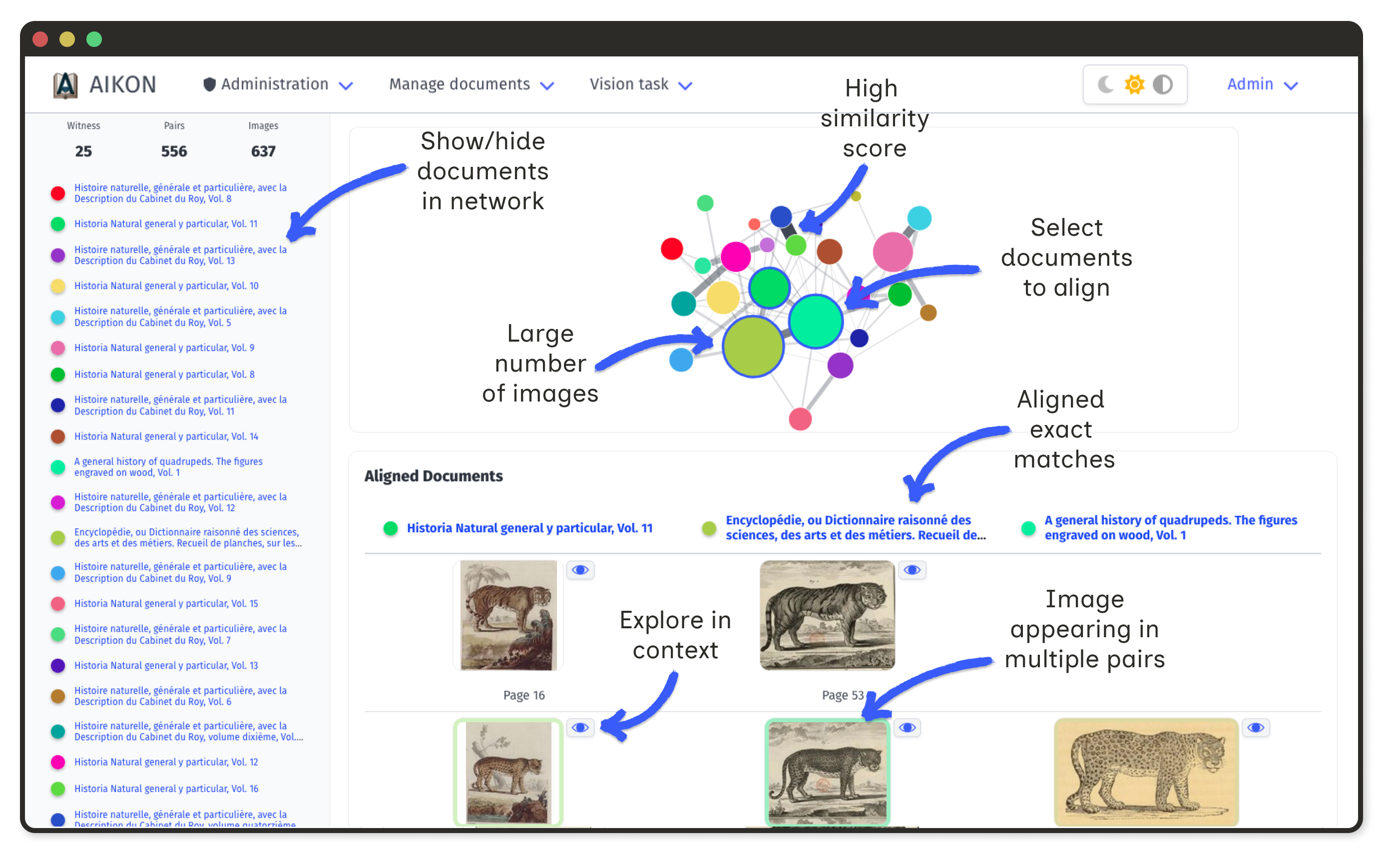
Select nodes to display a table of all connected regions. This makes it easy to identify visual shifts, such as systematic mirroring.
Region Network Graph
At the region level, the network displays all extracted regions from a document set. Nodes represent individual regions; edges represent correspondences.
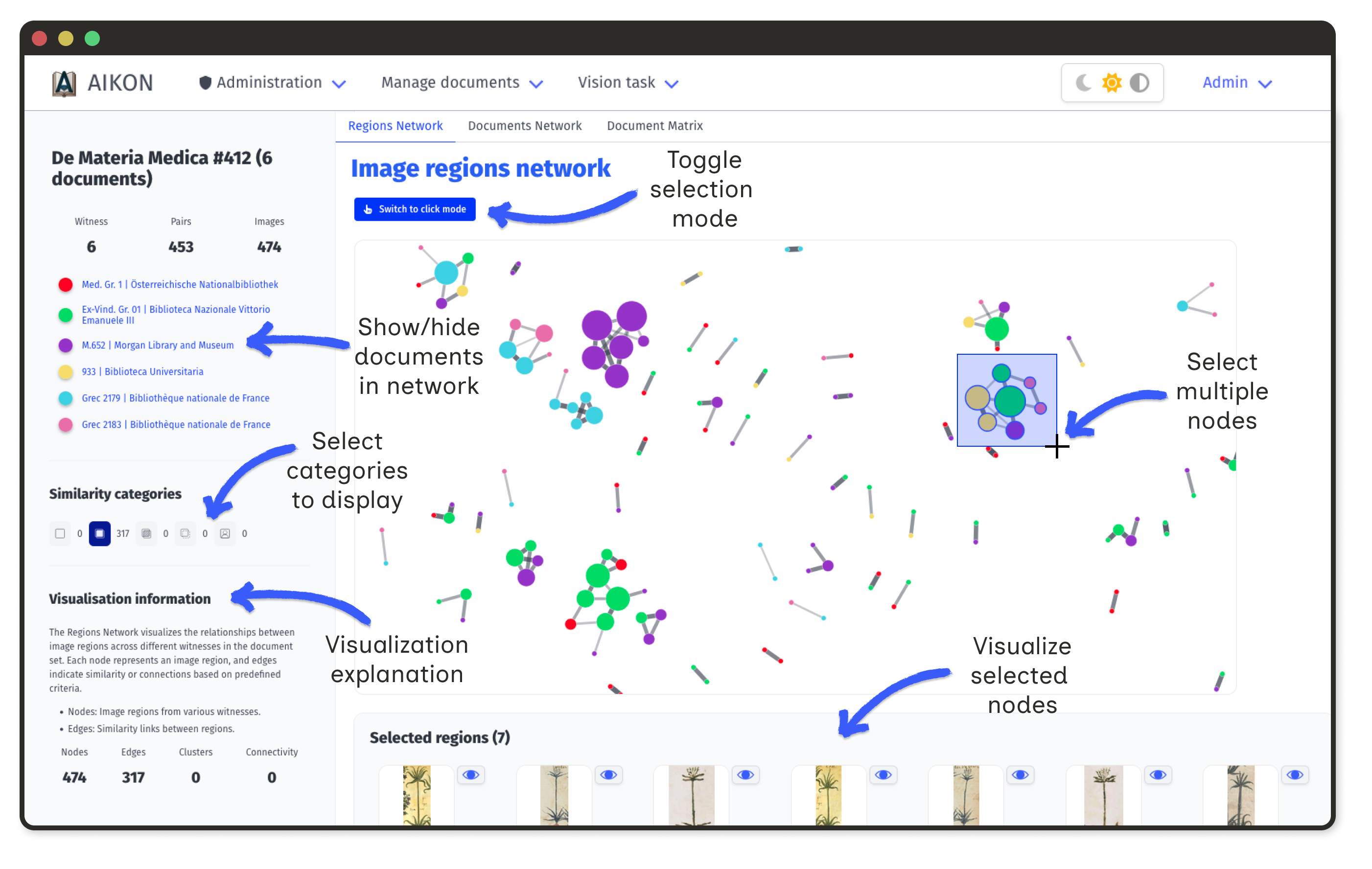
- Node size proportional to the number of connections
- Edge width reflects similarity score (when available)
- Selection click nodes to view images and metadata
Large nodes indicate commonly copied images. Isolated nodes represent unique illustrations.
Stemma editor
The stemma editor is an exploratory tool for testing hypotheses about document relationships. It allows you to construct a tree of filiation between documents and observe how similar regions propagate through this structure.
This tool does not automatically generate a stemma; it helps you visualize the consequences of a proposed transmission model by showing which images would be related under that model.
Stemma builder
The right panel displays all documents in the current set as movable nodes. You can arrange them to represent a hypothetical transmission tree.
Building connections
- Create an edge hold Shift and drag from one node to another
- Move a node drag it to reposition
- Rename a node double-click on it
- Edit or delete an edge double-click on the arrow
- Reset layout use the button in the top-right corner
The structure you build here determines how images will propagate in the visualizations below.
Spatial Frieze
The spatial frieze displays all regions extracted from one document (the "base document"), ordered by their position in the source. It reveals where similar regions are concentrated.
Each vertical position corresponds to a region (or a page, if "By page" is selected). The heatmap below indicates where regions were extracted in the document.
Blue lines mark regions that have matches in other documents. The intensity of the blue reflects how many similar regions exist: a bluer line means more matches above the current score threshold.
You can choose what the frieze compares against:
- Selected documents only documents connected in your stemma
- Full document set all documents in the set
Interactions
- Hover on a blue line to highlight which documents share similar regions
- Click on a document in the list below to make it the new base
- Click on a line to place that region in the image stemma
Image stemma
The image stemma mirrors your document stemma, but displays individual images instead of documents. It shows how a specific image might have been transmitted through your hypothetical tree.
How images are placed
When you click a region in the spatial frieze, the algorithm places it at its document's position in the stemma, then propagates outward to fill neighboring nodes:
- The selected region is placed at the base document node
- For each connected document, the algorithm searches for the best matching region (highest score among visible pairs)
- If a match is found, that region is placed and becomes the new starting point for further propagation
- If no match exists, the node displays a placeholder; this indicates a "dead end" where the visual chain breaks
Document Matrix
The document matrix is a pairwise comparison of all documents in the set. The visualisation logic is the same as the matrix described in the previous section.